Posts
New Yorker Political Cartoon
- Get link
- X
- Other Apps

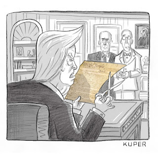
Hey everyone, it's Emily! Today we're unpacking the following political cartoon. Kuper, Peter. “Daily Cartoon: Thursday, November 1st.” The New Yorker , The New Yorker, 1 Nov. 2018, www.newyorker.com/cartoons/daily-cartoon/thursday-november-1st-obamas-constitution. (On the New Yorker website, this was accompanied by the caption "Just tell me which part Obama wrote".) There have been thousands of Trump-themed political cartoons since even before he took office. I chose a recent one so I didn't have to swim through the archives of newspapers with nothing better to produce. In any case, let's get started! First, let's analyze the style of the cartoonist. The drawings of people are realistic but lack detail and depth, which can contribute to dehumanization of figures. This can be seen especially with the figure we know to be Trump, whose exaggerated toupee, comical high rising eyebrows, and small, pupil-less eyes make him seem more like a demon than hu...
My Paper 1 Practice
- Get link
- X
- Other Apps
In our Paper 1 practice exercise, according to the feedback of my peers, I generally fell short of the criteria. Unfortunately, I mostly expected this of my writing. Going into the exercise, I had no idea where to start. I’d never seen a Paper 1 example before and I didn’t fully comprehend the task, so I had no jumping off point. Now that I’ve read some good and bad examples of a Paper 1 task and written a bad one myself, I know how I can improve my writing for this specific work. For Criterion A, my peer noted that I didn’t acknowledge the time period or audience. This wasn’t a goal I had in mind going into the task. However, now that I have had practice, time period and its relevant audience is an idea I will take into heavy consideration next time. Personally, I felt like I needed to analyze each text more and understand better how they relate to each other and what their differences are. These are lessons I will carry into my next attempt at a Paper 1. For Criterion B, my p...
Fair.org: "Challenging" "media bias" since 1986
- Get link
- X
- Other Apps

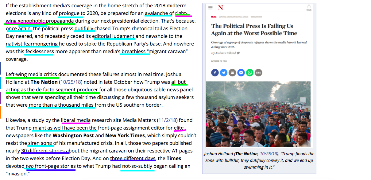
Hey everyone! Welcome back to my blog, the best blog ever to exist. Which reminds me, today's topic... Bias in the media is rampant, especially when you take into consideration the current political administration. No matter whose side you're on, you can look into the media and find articles that trash Trump to the ground, or that build him up on a pedestal, with few acknowledging both sides, or even the idea that there are two sides. Today we're examining an article from Fair.org, whose tagline is " Challenging media bias since 1986." Considering this claim, you'd think it would be a challenge for me to examine bias in their articles. You would of course be wrong. Below are some screenshots of the article , which I've annotated to highlight several different types of media bias. Colorful, right? Interesting for a site which is based on challenging bias in media. Now that we know the article is biased, let's examine how and why. The purpose of ...
The GAP Ads: A Question of Gender
- Get link
- X
- Other Apps

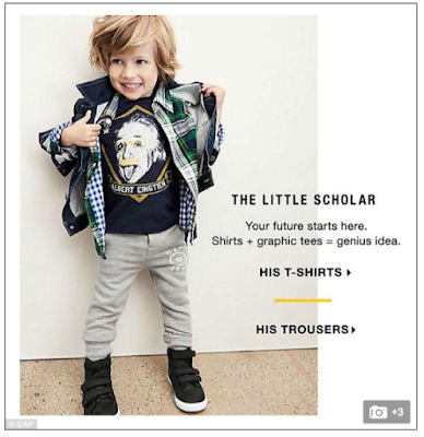
Hey everyone, it’s Emily again! Today I’m writing about a couple ads by GAP for children’s clothing. There’s one for boys and one for girls, and some of you are ahead of me on where this post is going. The major differences between the two GAP ads are the way the children are depicted. The smiling boy is depicted as intelligent and candid , while the “social girl” is pouty and posed. Looking at the first ad, I was pleased that GAP wanted to inspire young children to pursue scholarly careers. The girls’ ad brought everything crashing down. Instead of encouraging children, they’re supporting stereotypes. I’m a little disappointed in these ads. The implication here is that girls should be social instead of intelligent. It also implies that only boys can be intelligent and that they can’t be social. I’m not really okay with these ads. There’s a culture of sensitivity surrounding bigotry lately, but this is serious enough to cause a problem. I don’t think they warrant a huge storm...
Vonnegut, Maslow, Bhutan: What Makes You Happy?
- Get link
- X
- Other Apps

Hey everyone, Emily again! Today we’re going to be discussing happiness: the lusted-after emotion that money allegedly can’t buy. Personally, I find there are a limited number of occurrences which make me truly happy and don’t provide a brief distraction from my general unhappiness. Those are as follows: spending time with people (and animals!) I care about, the freedom to be and express myself to the capacity I desire, and the basic needs of eating enough and sleeping enough. I find I’m happiest when I’ve had a day off from work, school, and homework. I’ve probably eaten three decent meals and had enough water. If I’m lucky I might’ve slept enough the night before. And, more than likely, I have a cat on my lap and I’m with my friends, having a good time and being myself. Of course, taking my antidepressants always helps, but that’s not really the point of this post. The small nation of Bhutan began keeping track of their nation’s happiness using a nationwide survey, or an "...
Why, Kendall?
- Get link
- X
- Other Apps
Hey everyone! It's Emily again; welcome back! Right now, you're reading this post on the internet. If you have internet, you probably saw that Pepsi ad last year. You know, the Kendall Jenner Ad? Almost three minutes long, the ad brought controversy that lasted for weeks. And it's not even the worst of its kind. There have been ads by other companies (looking at you again, Dove) that have caused people to condemn the brand entirely. Many people will claim that the audiences of these controversial commercials are "being too sensitive" and "companies can't do anything these days". Today we're going to look at a couple ads that have elicited these types of responses. As we examine them, ask yourself this: is it hard for audiences to watch without getting offended, or is it hard for companies to avoid tone-deaf content? The first ad we'll look at is the aforementioned Kendall Jenner ad. The most striking component of the structure of this a...